About the Usage dashboard
The Usage dashboard shows usage within Amperity across a broad range of features. You can access the Usage dashboard from the menu that is located in the top-level navigation next to the name of your Amperity tenant.
Configure the time period
You can configure the time period that is used to display metrics and graphs on the Usage dashboard. From the dropdown in the top right of the page, select one of the following time periods: “Last 30 days”, “Last calendar month”, “Last 60 days”, “Last 90 days”, “Last complete quarter”, “Last year”, or “Last calendar year”.
Activations
The Activations section in the Usage dashboard has the following time period-based metrics:
- Queries executed
Shows the number of queries in the Queries tab have been run during the selected time period. This number is compared to the number of queries that were run during the previous time period.
- Segments available
Shows the total number of segments that are available during the selected time period. This number is compared to the number of segments that were available during the previous time period.
- Segments used
Shows the total number of segments that were used by campaigns that ran as of the last date in the selected time period. This number is compared to the number of segments that were used by campaigns that ran during the previous time period.
Along with the following graphs:
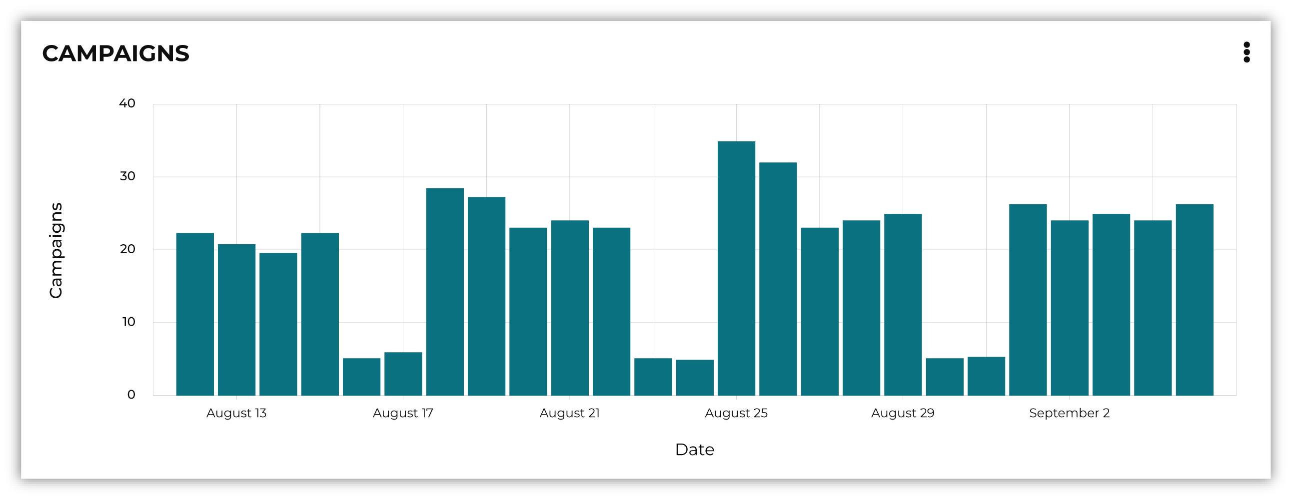
- Campaigns
Shows the total number of distinct campaigns that are run, by day. Campaigns that are sent more than once per day are counted once. Recurring campaigns are counted on the days they are run. Campaigns with more than one destination or sub-audience are counted once. Only successful campaign runs are counted.
- Customer profiles
Shows the total number of customer profiles (Amperity IDs) that are sent to destinations on a daily basis using campaigns.
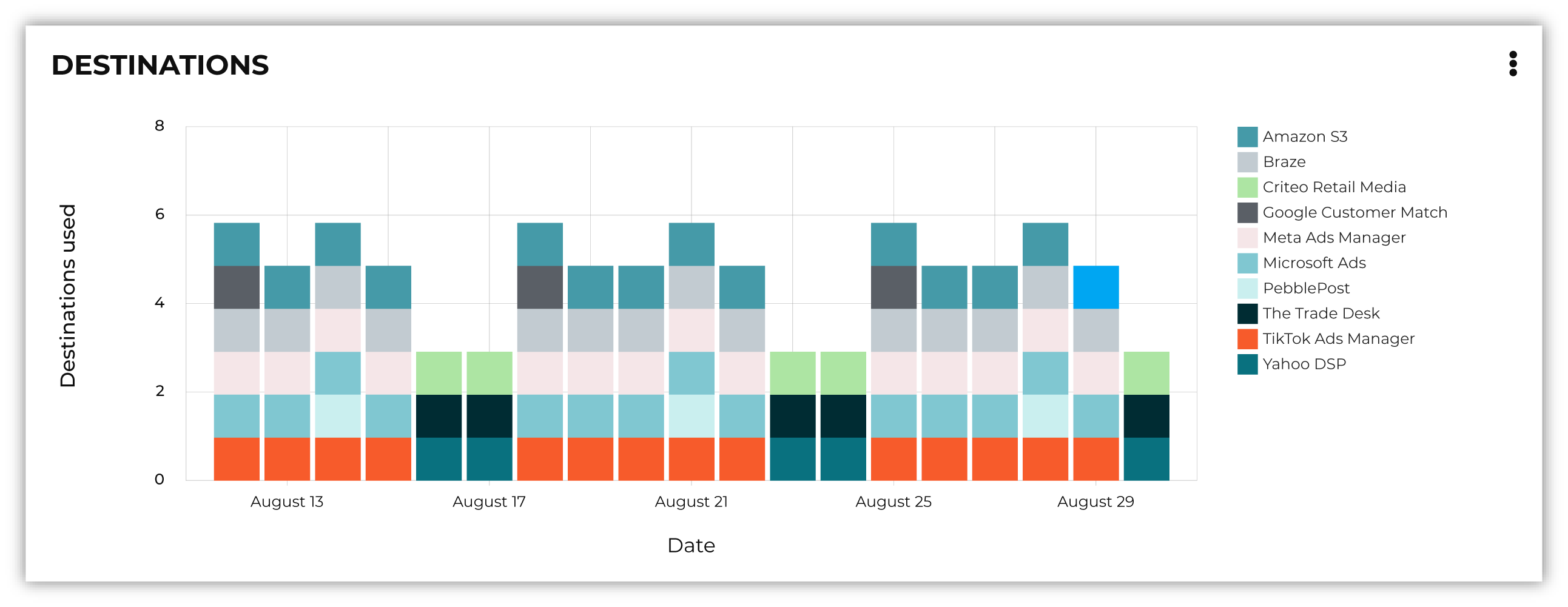
- Destinations
Shows the total number of destinations to which records are sent on a daily basis, along with the total number of destinations used.
- Records
Shows the total number of records that are sent from Amperity on a daily basis, including how many records are sent to each type of connector, excluding records that are sent using Amperity Bridge.
Customer profiles
The Profiles section in the Usage dashboard has the following metrics and graphs that describe the composition of customer profiles within your tenant:
- Total profiles
Shows the total count of all profiles to which an Amperity ID is assigned after Stitch is run.
- Change over time
Shows the percent change in profile counts during the selected time period.
- Average number of sources per profile
Shows the average number of data sources that are used to generate a stitched profile.
Along with the following categories:
- Profiles added over time
Shows the change in profile counts day over day. This can be a helpful indicator for understanding how new data sources can affect the profile count within your tenant and for debugging issues with Stitch results.
- Profile source composition
Shows the percentage of profiles with N number of distinct sources. Combine this view with Stitch metrics to identify which sources are used for identity resolution.
Sources
The Sources section in the Usage dashboard has the following metrics and graphs that describe source utilization:
- Sources configured
Shows the number of feeds configured in your tenant.
- Average records ingested
Shows the average number of records that are ingested per day during the selected time period.
- Ingest connectors used
Shows the number of connectors that have been used during the selected time period.
Along with the following categories:
- Sources over time
Shows the number of feeds that are used to ingest source data during the selected time period. Use this view to see how many individual feeds are being used compared to the number of feeds that are actively in use.
- Records ingested
Shows the number of records that are ingested across all connectors day by day. Use this view to identify spikes, anomalies, and missed data.