About Stitch results
Stitch uses patented algorithms to process massive volumes of data and discovers the hidden connections in your customer profiles that identify unique individuals. Stitch an identity graph in which every unique customer profile is assigned an Amperity ID.
About the Stitch page
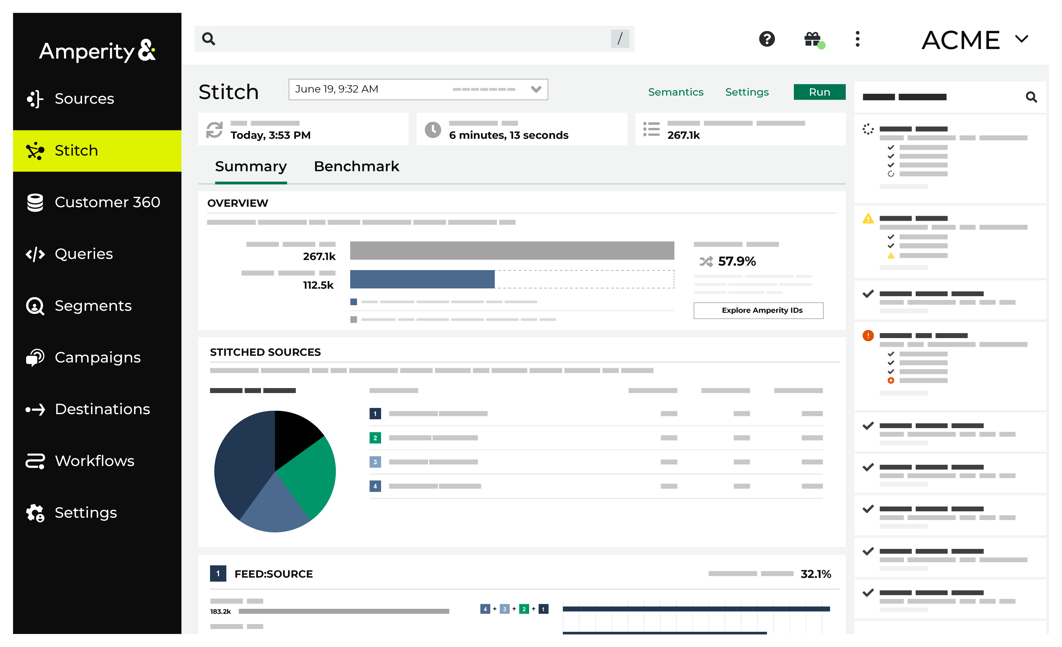
The Stitch page shows detailed results of identity resolution, which analyzes customer data, applies the rules you define, and then builds an identity graph with accurate and actionable customer profiles. Each customer profile is assigned an Amperity ID.
Run Stitch
A Stitch run can be started manually by clicking the Run button at the top of the Stitch tab. A Stitch run may be started automatically by an upstream process, such as after successful domain table updates that were initiated by courier group automation.
Select domain tables
Stitch only runs against selected domain tables. A domain table is made available to Stitch by the Make available to Stitch configuration setting in the Feed Editor.
A domain table that is made available to Stitch must also be selected from the list of domain tables in the Stitch settings dialog box.
Each selected table is processed and compared for identity resolution, after which Amperity IDs are assigned to each of your unique customers that are discovered across all domain tables that are included in the Stitch run.
To add tables to the Stitch run
From the Stitch tab, click Settings. This opens the Stitch settings dialog box. On the Stitched tables tab, select each of the tables to include in Stitch results, and then click Save.
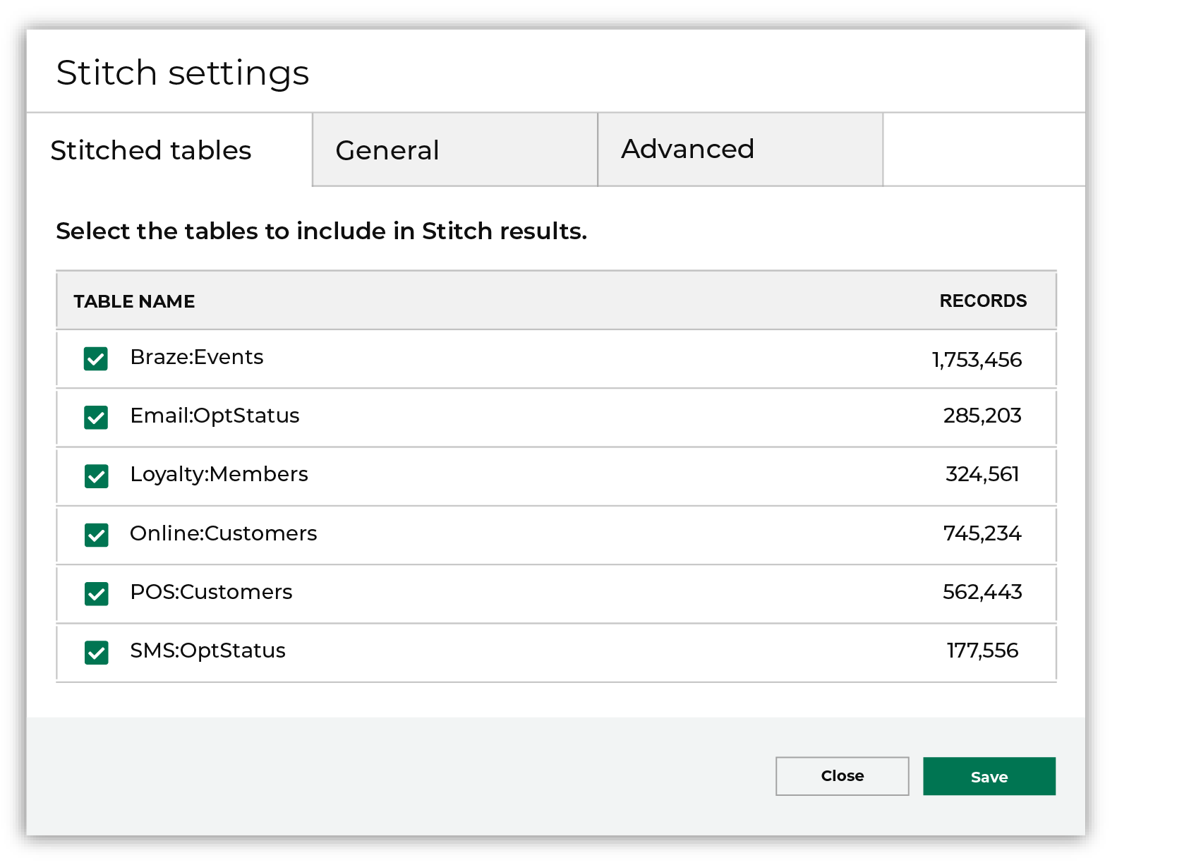
After you have selected the list of tables to include in Stitch results, return to the Stitch page, and then click Run.
Note
Only tables with the Make available to Stitch setting enabled in the Feed Editor are available for selection from the Stitched tables tab in the Stitch settings dialog box.
About Stitch run types
A Stitch workflow runs out-of-date source transforms and automatic databases. A Stitch workflow has the following options for reevaluating customer profiles:
Force refresh
A force refresh Stitch run reevaluates all profiles. Profiles may be split or merged. Records with PII may be reassigned to different profiles.
Incremental matching
An incremental Stitch run does not reevaluate existing profiles and only attaches new records to existing profiles or creates new profiles. Profiles are not split or merged. PII is not reassigned.
Note
Stitch benchmarks are unavailable when Stitch runs using the incremental matching run type.
Normal
A normal Stitch run reevaluates all profiles when source tables have updates or after changes to Stitch configuration. Profiles may be split or merged. Records with PII may be reassigned to different profiles.
About the Stitch run
A Stitch run takes a certain amount of time, depending on the size of the data analyzed and the number of potential pairs in the data. In general, you should expect to wait at least 20 minutes, but as much as 2 hours, for a Stitch run to complete.
You can navigate to other areas of Amperity and do other tasks while waiting for Stitch to complete successfully. Stitch has two notifications: the Stitch run, and then the Stitch report. The UI will refresh with updates when the Stitch report has been generated.
Important
Before starting the Stitch run, verify that all tables that should be analyzed by Stitch have been made available to Stitch via the Feed Editor, that all processes that load data to Amperity, including couriers, feeds, and domain tables, have finished processing, and that all domain tables are selected.
Explore Stitch results
The Stitch page shows the outcome of the Stitch process, including the number of unique Amperity IDs in customer data and a series of charts that highlight the connectivity between data sources.
The Stitch overview provides a high-level set of statistics about the current state of stitched records in Amperity, including deduplication rates and a way to explore Amperity IDs in the customer 360 database by stitched records, cluster graphs, pairwise connections, and by data source.
Explore by Amperity ID
An Amperity ID is a unique identifier assigned to a cluster of records within an identity graph. Each Amperity ID represents all of the records within a customer profile.
As new data is input to Amperity, the Stitch process identifies when new or changed data applies to existing clusters of customer records, and then updates those records, maintains the cluster, and retaining a stable Amperity ID assignment. A new Amperity ID is only created when new individuals are identified.
Note
The Amperity ID is a universally unique identifier (UUID) that is 36 characters spread across five groups separated by hyphens: 8-4-4-4-12.
For example:
123e4567-e89b-12d3-a456-426614174000
Amperity IDs do not replace primary and foreign keys already assigned in customer data. Amperity IDs exist alongside primary and foreign keys within the customer 360 profile and act as key for finding clusters of unique customer records.
To explore by Amperity ID
From the Stitch tab, click the Explore Amperity IDs button.
This opens the Data Explorer to the Stitched Records tab.
Use the left and right arrows surrounding the full name to view additional records.
Click through each record and each tab. When finished exploring, click Close.
Explore by data source
The Stitched Sources section of the Stitch page shows a comparison of domain tables and the record pairs identified both within each data source and across all data sources. This is presented as an UpSet Plot chart with links to the underlying data sources via the Data Explorer.
The following diagram shows the components of the UpSet plot chart, inclusive of the distribution of Amperity IDs across all data sources, and then for each data source, an individual breakdown of how that data source compares to all other data sources. An UpSet plot chart have a row for each data source. This diagram shows the first two only.
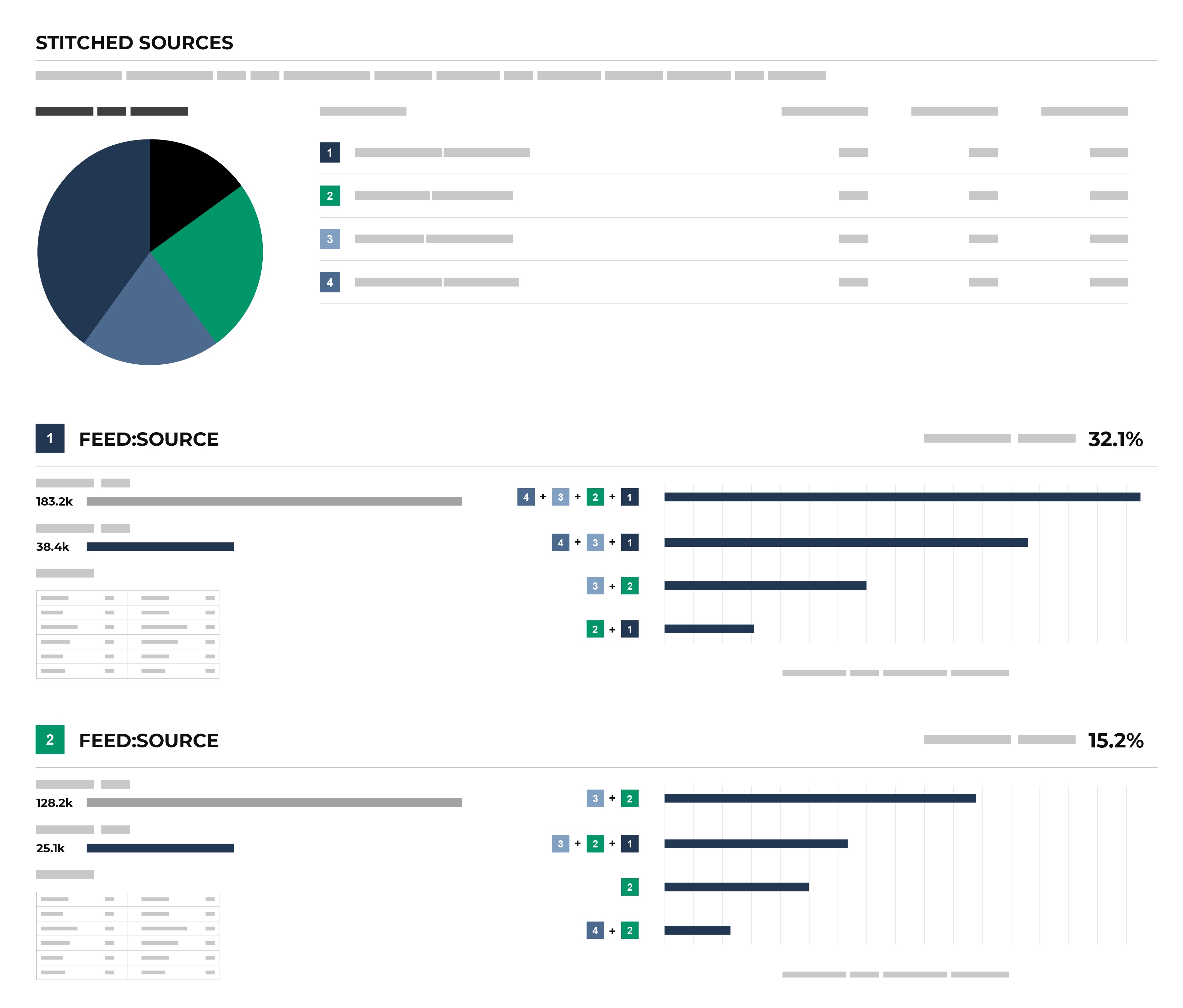
Each individual stitched data source can be explored from the UpSet plot. The UpSet plot includes a source-by-source breakdown of stitched data. For each record, a View source link is available. This opens the Data Explorer and displays a Schema for the data source that shows the name of the field as it is defined in customer data, the data type, the Amperity semantic applied to the field, and sample data. A Sample shows 100 records from that data source, where each of the fields defined in the customer data source are presented as columns of data.
To explore by data source
From the Stitch tab, under Stitched Sources, review the UpSet plot chart.
Click the database table name for any database table in the Upset plot chart to view more information about that data source.
Click the View source link to open the Data Explorer for that table, in which you can review the schema and view sample data.
When finished exploring, click Close.
Explore previous Stitch results
You can explore previous Stitch results from the Stitch tab. From the Stitch tab, next to the Stitch page title, select a result from the dropdown menu to view the Stitch results for that Stitch run.
Explore semantics
A semantic is a way to apply a common understanding to individual points of data across data sources, even when data sources have different schemas, naming conventions, and levels of data quality.
The Semantics link at the top of the Stitch page opens a dialog box that lists the configured semantics made available to Stitch from domain tables. This list is broken down by domain table, and then by semantic. For each semantic, it lists the semantic, its data type, and the name of the field as defined in customer data.
To explore semantics
From the Stitch tab, click the Semantics link. This opens the Stitch Tools dialog box.
Each table that contains stitched records is listed in the dialog box.
For each table, a list of semantic names, their types, and the fields to which they are associated is listed.
When finished, click Close.
View cluster graph
Clustering is the process of grouping customer records into a customer profile during identity resolution. Distinct customer profiles emerge as connected record pairs.
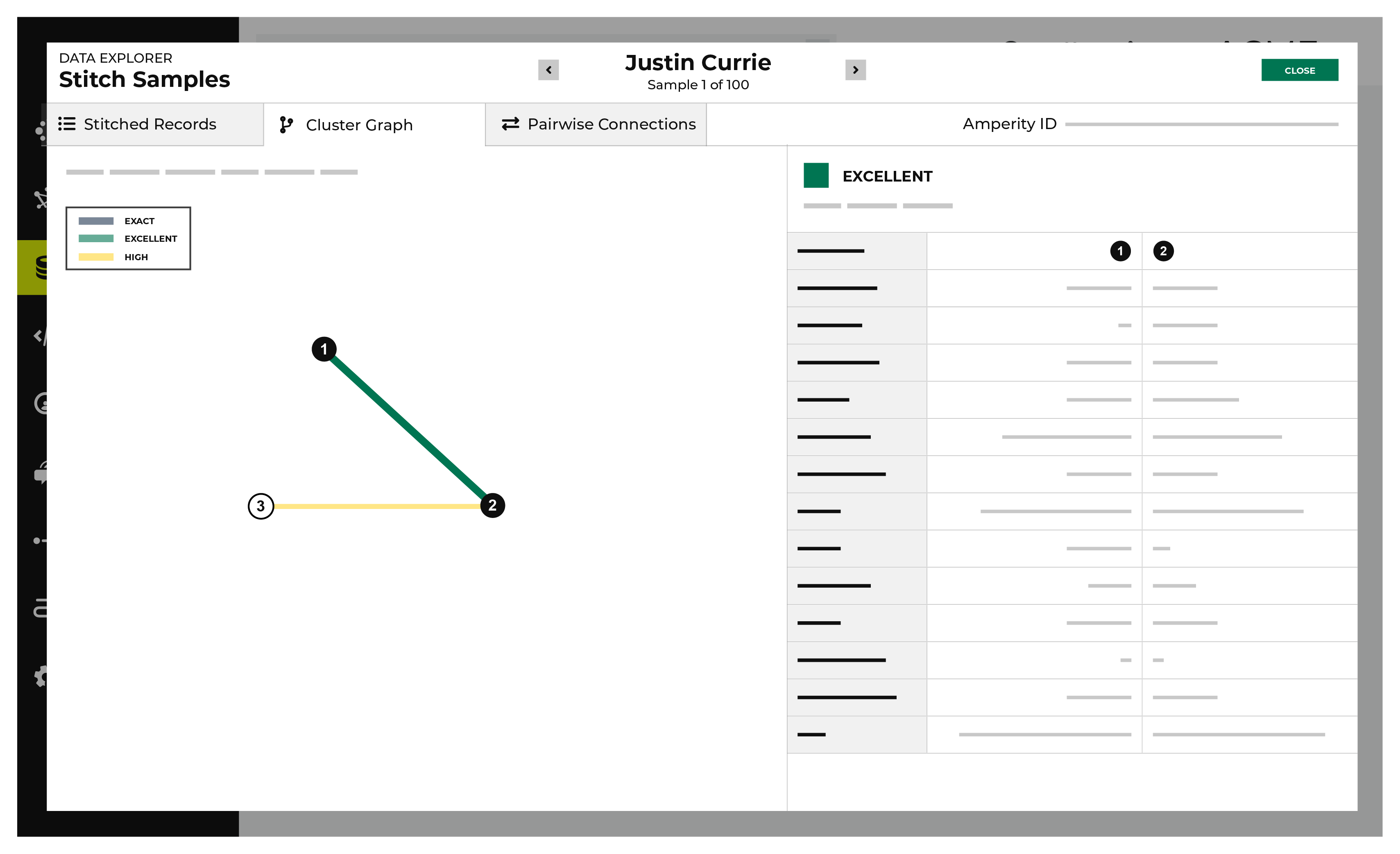
A cluster graph a visual representation of every pairwise connection in a cluster of records within an identity graph.
The Cluster Graph tab in the Data Explorer shows a graph with a line relationship between each stitched record, along with a detailed breakdown of PII similarities and differences for each pair of stitched records in the cluster graph.
To view the cluster graph
From the Stitch tab, click the Explore Amperity IDs button.
This opens the Data Explorer to the Stitched Records tab.
Click the Cluster Graph tab.
In the cluster graph, select individual lines to view the details for that pair of records. The columns on the right shows the fields in the records that are associated with PII semantics. Compare the values on each side to see how these two records match.
Use the left and right arrows surrounding the full name to view additional cluster graphs for additional record clusters.
When finished exploring, click Close.
View deduplication rate
A deduplication rate represents the total number of unique individuals within an identity graph. This rate measures the difference between the total number of identifiers in source data and the total number of Amperity IDs assigned to unique customer profiles.
Example
A tenant has three sources of customer records represented by tables 1, 2, and 3. In the Stitch report the:
Total number of records is 314.1k
Total number of clusters is 212.0k
Overall deduplication rate is 32.5%
Individual deduplication rates for three customer records are 7.7%, 6.6%, and 0%
How is this possible?
The overall deduplication rate (32.5%) represents the total number of records relative to the number of Amperity IDs. There can be a low deduplication rate on individual tables, but high connectivity between tables.
An UpSet plot chart has a row for each table. In this case, the row for table 1 shows 117k source IDs and 108k Amperity IDs. This represents a 7.7% deduplication rate.
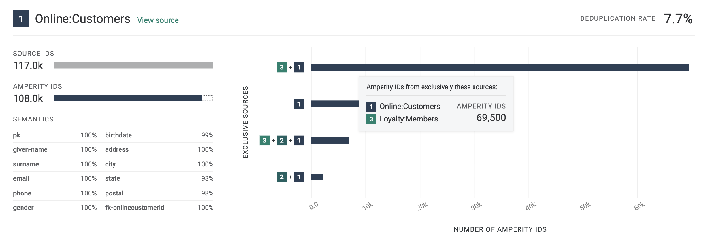
Next compare the overlap between customer records 1 and 3 by hovering over customer record 1. The hover box shows there are more than 69k records shared between tables 1 and 3. This is a significant amount of overlap between two tables and is the primary contributor to the 32.5% overall deduplication rate.
Deduplication rate, explained
The deduplication rate is the reduction that occurs when the total number of Amperity IDs are compared to the original source IDs provided in customer data. For example:
Total records: 314.1k. The sum of all records from all tables.
Total clusters: 212.0k. The sum of all clusters from all tables.
Records in table 1: 117k. The sum of all records in table 1.
Clusters in table 1: 108k. The sum of all clusters in table 1.
The overall deduplication rate is 32.5%:
100 * [(314.1k - 212.9k) / 314.1k] = 32.5%
The deduplication rate for table 1 is 7.7%:
100 * [(117k - 108k) / 117k] = 7.7%
Important
Deduplication rate depends on many factors. The previous example shows deduplication rate for a database that does not use customer keys:
(total customer records - Amperity IDs) / (total customer records)
When a database uses customer keys, the math to determine deduplication rate is the same, but the starting point is the customer keys.
(total customer key records - Amperity IDs) / (total customer key records)
To view deduplication rate
From the Stitch tab, under Overview, review the total source IDs and total Amperity IDs.
The deduplication rate is shown on the right as a percentage.
View notifications
Notifications for Stitch reports that run in the Stitch page appear after Amperity creates clusters of records based on the connection between pairs, and then gives each cluster a unique Amperity ID. Notifications typically indicate successful outcomes. Less often, notifications contain details for non-successful outcomes, such as failures related to upstream or downstream processes.
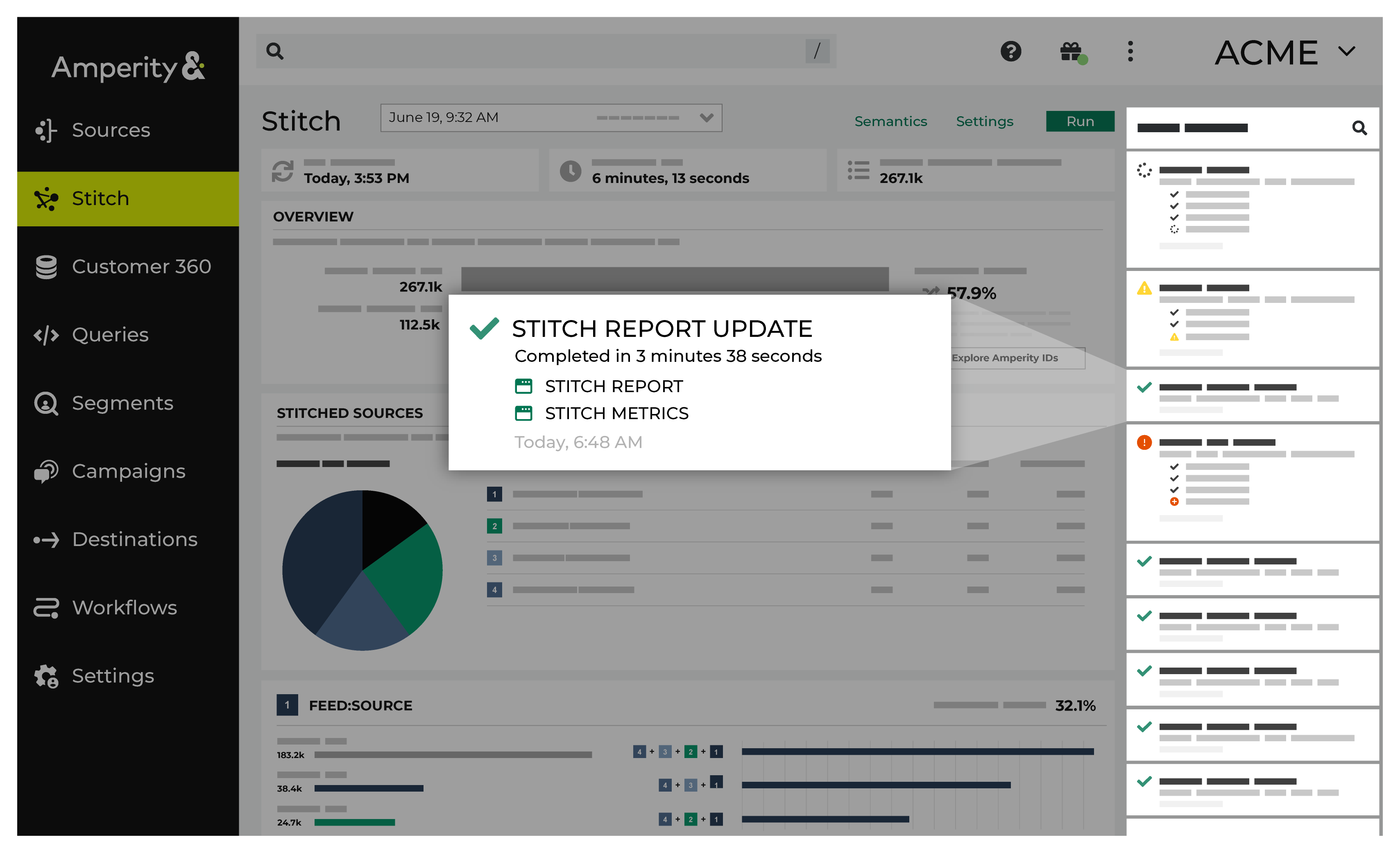
If a notification is about a non-successful outcome, the details for why and what happened can be found in the notification itself. Click More to view the full notification. Click View Workflow to open the workflow in the Workflows page.
In some cases viewing the log files may be helpful. In many cases, fix the root cause of the non-successful outcome, and then rerun the process manually. The Workflows page provides a set of workflow actions that you can initiate directly.
View pairwise connections
A pairwise connection is a pair of matching records assigned a score high enough to belong to the same customer profile.
The Pairwise Connections tab in the Data Explorer shows a breakdown of stitched record pairs by score.
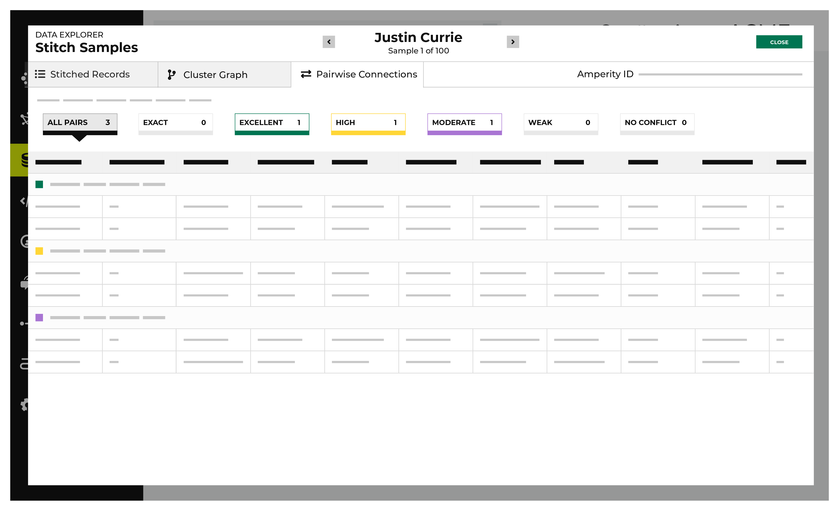
A pairwise connection has a score with two parts separated by a period.
The first part–the record pair score–correlates to the match category, which is a machine learning classifier applied during identity resolution to individual record pairs:
5 for exact matches
4 for excellent matches
3 for high matches
2 for moderate matches
1 for weak matches
0 for non-matches
Identity resolution uses the second part–the record pair strength–to show the quality of the record pair score. This value appears in the Stitch report as a two decimal number. A record pair strength by itself is not a direct indicator of the quality of a pairwise connection score.
To view pairwise connections
From the Stitch tab, click the Explore Amperity IDs button.
This opens the Data Explorer to the Stitched Records tab.
Click the Pairwise Connections tab.
Pairwise connections are broken into categories by strength of connection: exact matches, excellent matches, high matches, moderate matches, weak matches, and no matches. Click each category to view individual records by strength of connection.
Use the left and right arrows surrounding the full name to view additional pairwise connections for additional record clusters.
When finished exploring, click Close.
View Stitch metrics
You can view metrics for changes to records and Amperity IDs that may have occurred between Stitch runs. Click the Stitch Metrics link in the notifications pane to open the Stitch Metrics dialog box.
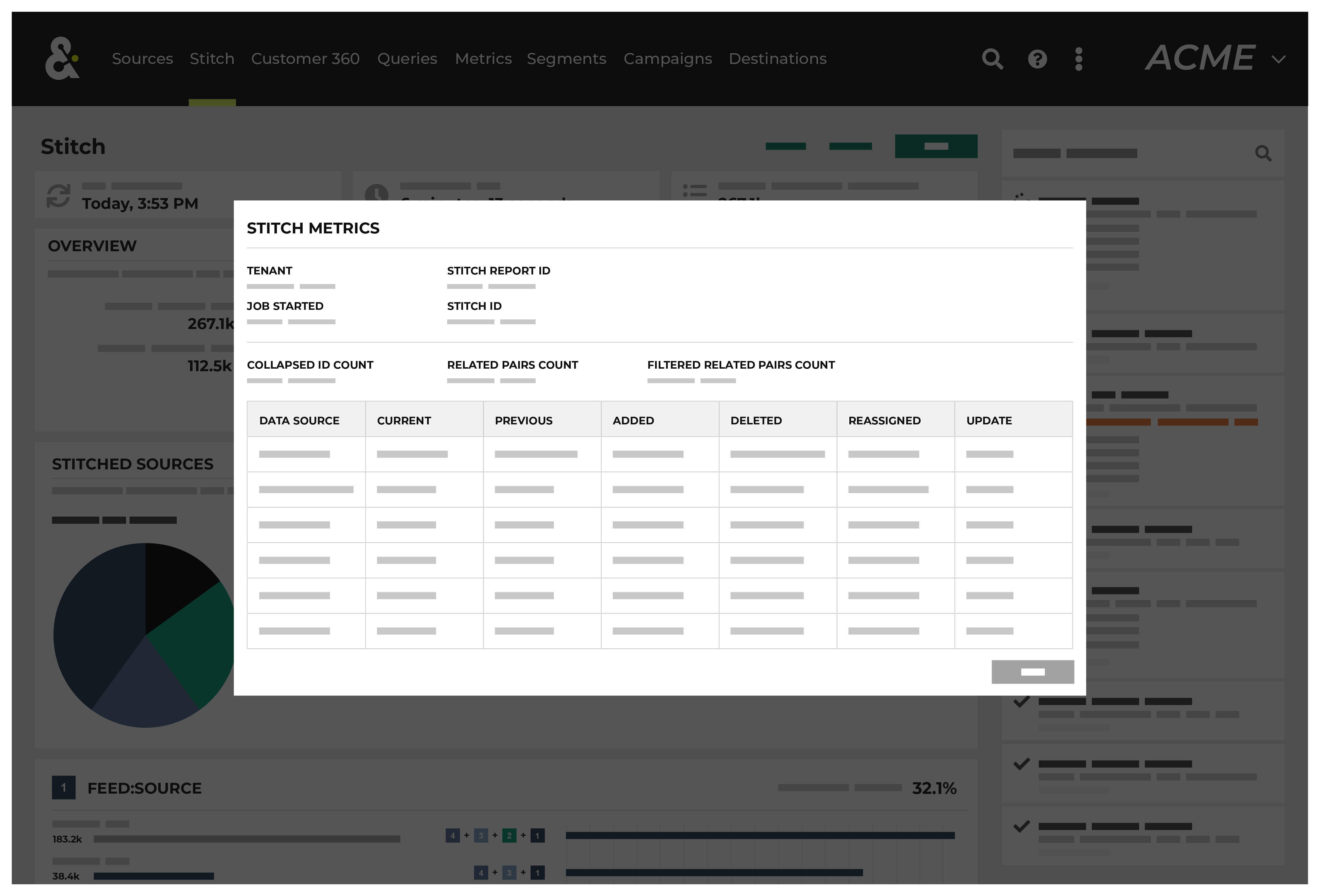
This dialog box identifies the tenant, the time at which the job started, the ID for the Stitch report, and the Stitch ID, and then shows the following details about this Stitch run:
The collapsed ID count refers to the number of records present after nearly identical records were removed.
The related pairs count shows number of unique record pairs that were identified by a blocking strategy.
The filtered related pairs count shows the number of unique record pairs that scored above the matching category threshold.
The table contains a row for each data source that was made available to this Stitch run, along with columns for each row that show:
The number of Amperity IDs in the current Stitch run.
The number of Amperity IDs in the previous Stitch run.
The number of Amperity IDs in the current Stitch run that were not in the previous Stitch run.
The number of Amperity IDs that were in the previous Stitch run, but are not in the current Stitch run.
The number of distinct cluster transitions. A cluster transition occurs when records move from one cluster to another.
The number of distinct cluster transitions, including those from records added to or deleted from the dataset.
View stitched records
A stitched record is a unique output of identity resolution that associates the Amperity ID to customer records in source tables.
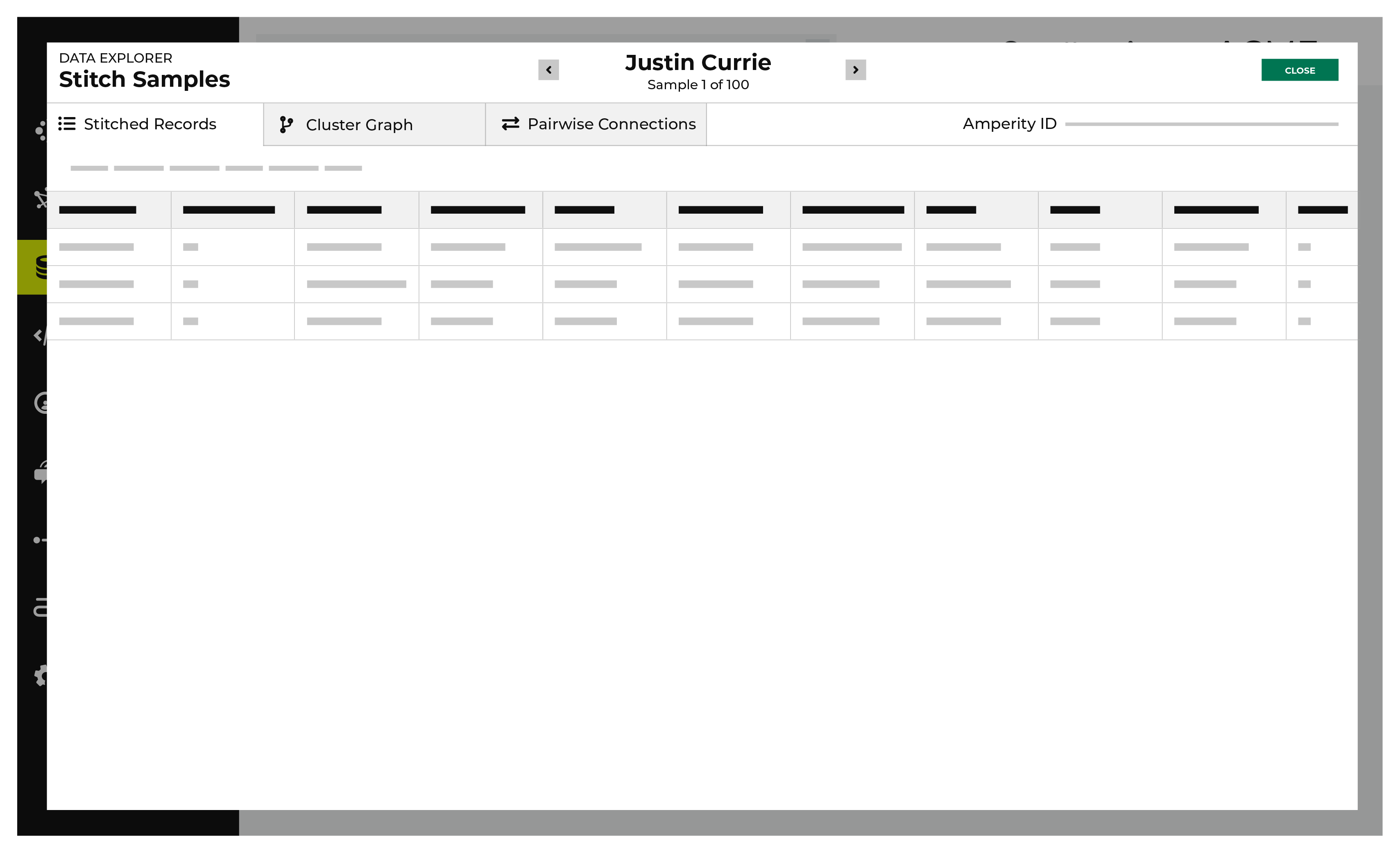
The Stitched Records tab in the Data Explorer shows a table with a row for each of the individual records that share the same Amperity ID.
To view stitched records
From the Stitch tab, click the Explore Amperity IDs button.
This opens the Data Explorer to the Stitched Records tab.
All of the records that are associated with the same Amperity ID are listed. Columns show the differences beween each record.
When finished exploring, click Close.
View profile attributes and interactions
The Profile attributes and Interactions tabs are available in the data explorer. These show information about customer 360 attributes and interaction records for an individual customer.
To view profile attributes
Create a database with the Unified Scores and Unified Customer tables, and add a customer 360 table that is tagged with a table semantic.
In the query editor select the database.
Create and run a query that returns a list of customers.
Click an Amperity ID in the results to open the data explorer.
On the Interactions tab, select a table in the Show matching records from field.
View each interaction record.